Friday, April 30, 2010

Questions about Box Jellyfish

Debbie Foster recently asked, "How do you get the effect of the incredible glow of the jelly fish?"

I dug up my source files for Box Jellyfish to look over the technique. I'd say the biggest factors in the glow are:

#1. No lines for the jellyfish. The jellyfish was supposed to look translucent and ethereal. I realized fairly early that a hard outline in my sketch would work against that. When I painted the sketch, I obliterated most of the underlying line work for the jellyfish. Looking at my source files, I can see there's only a bit of the jellyfish still present in the lines (it was probably too much hassle to clean up these bits). What line work is left is set to 'overlay' so it picks up much of the underlying tone in the painting. In the picture below you can see what I mean.


#2. I painted the jellyfish on its own layer. Here it's presented against a black backdrop.
 

I figured since the creature was mostly translucent, the light would pipe through the body structure (like fiber optics), emphasizing edges and any area that was more solid. I tried to approach the work thoughtfully, looking over underwater photography of jellyfishes and how camera lights render them with a spooky glow. It's sort of like an X-ray photo, but emphasizing the outer edges over the vacuous innards.

#3. I placed a blurry blue color dodge layer over the jellyfish, to give it a softer look and a diffuse glow. There's also another lighting layer used to place a soft glow on the areas of the background affected by the jellyfish's outstretched tentacles.


Aside from that, the reason the jellyfish glows is color choice and contrast. The picture is dark, the jellyfish is bright and blurry.

Hope that answers your question.

For more clues on how the picture was made, see the work-in-progress image I've provided.


Also see this study I did, using a long exposure photo of a nightlight in my bedroom.

 Spooky.

-Jared.

Friday, January 15, 2010

Fantasy Illustration - Tiamat's Chosen - Final

This is a mock fantasy book cover, set in the Forgotten Realms universe, that I did on commission.

The client wanted something that was akin to a Star Wars movie poster with characters sprinkled throughout the image. The blue character, Ningal, is some sort of important leader in the country of Unther. The other famous character in the image is Tiamat -- she's in the upper right corner. She's a dragon deity in cloaked in human form. The client wanted her depicted as a sort of spunky teenager girl.

During the process of creating this picture I worked out a design for each character before combining them into the picture. Here's the related character design blog posts.

Friday, January 8, 2010

Fantasy Illustration - Tiamat's Chosen: Designing the rest

The remaining three characters in the Forgotten Realms illustration were original player characters which needed to be designed from scratch. Working from text descriptions and story details, the characters took form.

Zeldara was described as a druid with wild brown hair and natural earth toned clothing. I wanted to give her an untamed, living-close-to-nature look, so I added some scattered flowers throughout her tangled hair. Here you can see the build up from basic body, to clothed figure.


Xaxier is the key figure in the story. He's a tall and strong monk/assassin with questionable morals that fights with his hands. His key features are the three concentric blue circles on his forehead and golden eyes and skin.


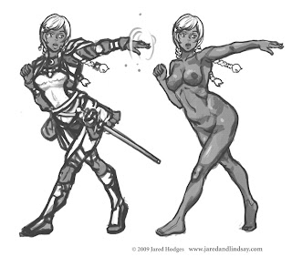
Firaelia is a half-elf mage. She carries a rapier and casts Shadow magic. She is the shortest and most curvaceous of the bunch.


Finally, here's the height chart showing how they all line up with each other. Xavior and Ningal are among the tallest.


Coming up next, the finished illustration!

If you missed it, here's the previous character design installment: http://quasieducational.blogspot.com/2009/12/fantasy-illustration-tiamats-chosen_31.html

Thursday, December 31, 2009

Fantasy Illustration - Tiamat's Chosen: Designing Ningal

Continuing the character design feature from last time, next up on the design plate is Ningal. Like Tiamat, Ningal is a pre-existing character in the D&D Forgotten Realms universe. This design was very straightforward. In the sketch, you can see how she compares to Tiamat's design - taller, with a more athletic build. I always tried to be very conscious of making every character unique from head to toe - not just clothing and facial features, but also their body type and build.


Sunday, December 27, 2009

Fantasy Illustration - Tiamat's Chosen: Designing Tiamat

A recent book cover commission I worked on called for five detailed fantasy-themed character designs. In a series of blog posts over the next week or two, I'll talk about some interesting points about each of character designs.

First up is Tiamat, a canonical character of the Dungeons & Dragons Forgotten Realms universe. The client called for some substantial changes to her appearance, however, so she's very different in these design sketches.


My initial pass on her was a modern take on the classic design in Jeff Easley's Tiamat painting.

The client liked a lot of the design elements of the initial design, but had a younger, playful and flirtier Tiamat in mind, so it was back to the drawing board for a second pass.


In the second design she's shorter and less curvy, more impish rather than sinister.


I also came up with some variations on her outfit. #1 is the classic fantasy bikini, but this interpretation of Tiamat called for a more modest costume, so I tried a number of other designs. All of them feature dragon claw shoes, a nod to Tiamat's other form, a five-headed dragon. The client chose design #4, which you'll see in the finished illustration.

Friday, October 9, 2009

Pegasus Anthro in the Clouds - WIP

It’s a bird. It’s a plane. No, it’s a flying Pegasus anthro in a flowing white gown. This image is from my upcoming book, Draw Furries. Since we weren’t able to fit a step-by-step demo for this image in the book, (you know, limited space in publishing and all that) I’ve posted a series of buildup sketches, and work-in-progress snapshots of the painting process here on my blog.

Now here’s a meaningless question to ponder. Are Pegasi an offshoot horse species, a specific breed of horse, or can any horse be a Pegasus if you slap a pair of wings on them?


Anthro Pegasus under development. From basic form thumbnail to rough sketch.

Final sketch.

Color WIP. Follow the numbers.

Thursday, October 8, 2009

Domo Invaded My Life!


Domo invades my life and work.

I just received my author copies of DOMO: the Manga from Tokyopop. Thank you, Hope Donovan (my editor)! I'm really impressed with TP's production values on this project. The book is in FULL COLOR and the trim is slightly larger than a typical manga, perfect for DOMO's highly visual stories.

Lindsay and I put together two chapters for the book. Like with our previous book, Peach Fuzz, Lindsay drew the line art, while I did cleanup, coloring, and effects.

Aside from myself and Lindsay, several other artists participated in putting DOMO the manga together. They include:

Priscilla Hamby - A.k.a. rem (http://www.blackmoontides.com/)
Sonia Leung (http://www.fyredrake.net/)
&
Maximo V. Lorenzo (http://8bitmaximo.com/) Who did a 4 page comic that shows up in the exclusive 7-Eleven version of the DOMO manga. (Way to go Maximo! I love the penguin rock band!)

So, next time you're out, drop by a 7-Eleven or you local book store and check out a copy of DOMO: the Manga. If you're like me, and hardly ever get out of the house, you can always pick up the book on Amazon.

BUT WAIT! There's a SPECIAL option. I'm now taking pre-orders for the Domo book through my website. Go here to place an order: http://www.jaredandlindsay.com/comics.html If you order a copy before October 17th, you'll get a bonus original sharpie marker rendering of Domo-kun by Lindsay Cibos included with your order. PLUS, purchasing a book enters you in our Peach in Portugal Giveaway (see details on my website here: http://www.jaredandlindsay.com/home.html)!